Colour a pivotal element that influences 50%-85% of consumer purchasing decisions
Effectively integrating colour into product design and brand strategy is essential for building a strong brand and product identity.
Colour is the most important design element to attract consumer attention and create a mood, influencing 50%-85% of consumer product purchasing decisions. This is according to a presentation by colour systems provider Pantone at a recent seminar organised by the Hong Kong Trade Development Council (HKTDC).
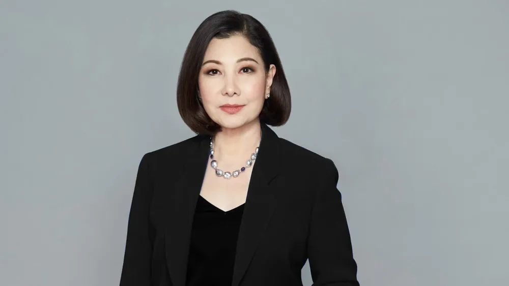
Maryann Wong, director of Sales and Marketing for Pantone in the Asia-Pacific region, discussed the importance of colour in product and brand marketing, and explained the psychological and physiological effects of different colours and shades, and how their tactful use can help achieve design objectives at a seminar during the 33rd HKTDC Hong Gifts & Premium Fair in April this year.
As 80% of human experience is filtered through our eyes, visual cues are essential for getting a message across successfully and colour is much more prominent than shape or text, explained Wong. She pointed out that we have both physiological and psychological responses to colour, but that most of our reactions to colour are intuitive and emotional; only 5% is rational. As you have only three seconds to catch a consumer’s attention on average, the first impression a colour makes is critical from a product marketing perspective, and managing the psychological meanings of colour is key to communicating your story and making an emotional connection with your audience, she added.
Each colour and shade has a unique meaning and message, according to Wong, and understanding the psychological aspects of colour can help designers use colour as a strategy. She explained that while consumer reactions to colour generally remain constant over time, they can sometimes change considerably or simply evolve, so colour decisions must be based on current information.
Colour messages
At the seminar, Wong reviewed today’s messages represented by some of the main colours:

Colour is a pivotal element in the design process and the single most important part of visual design, and that if used properly, it can make a company, as well as its brand and products, stand out from its competitors.
❖ Red elicits the strongest of emotions in every culture, she maintained, describing the colour as “captivating”, “exciting” and “provocative”. Associated with fiery heat and warmth, it increases the metabolism by 13%. Its connotation of vitality makes it a good colour for sports activities and sports drinks. Red is an attention-getting colour, she explained, but it dominates the surrounding colours, so it must be used judiciously. Red is the most accepted bright colour for brands across cultural boundaries, because it connotes excitement and high energy in all parts of the world. She pointed out that in most Asian countries, red is associated with good luck, joy, prosperity, happiness and long life.
Combining red with magenta and purple creates an elegant, cultivated and, refined image, she said, which can be used to advantage when promoting luxury products.
❖ Pink captures some of the essence of red, but is more playful, theatrical and bold. Hot pinks radiate high energy, beauty and sensuality, while the lighter pinks and roses connote sweetness and innocence, she said.The evolution of pink began in the 1950s, Wong shared. It was only then that pink was first closely linked with women. In fact, it became the colour of the decade. Companies started using pink in their products and marketing that targeted women. Then in 1959 the pink Barbie doll entered the hearts and minds of little girls. It was the way the colour was marketed that determined its acceptance, she declared.
But more recently, “protest pink” emerged, as an expression of strength and a rejection of outdated attitudes. Consequently, the colour has become more appealing to male consumers, she explained. It has also gained wider acceptance in all product categories, as well as in restaurant and office design.
❖ Yellow, associated with the sun, is the essence of light, signifying vitality and energy, and suggesting intellectual curiosity, according to Wong. It sharpens the memory and helps concentration. Seen as the happiest of colours, yellow is popular for children’s toys and clothing. Because it is an attention grabber, especially with black, it is often used in warning signs and to make products stand out in the marketplace.
❖ Orange is a symbol of the fruitfulness of life, she said. The bold and brighter shades are the most fun-loving and impactful, while the shades closer to red are more sultry and sensual. Orange appeals to our senses, stimulating the appetite, so it is good for food products and fast-food restaurants. The 1990s saw the birth of orange in the fashion world, with the deeper orange shades signifying strength, endurance and luxury and the softer peach hue signifying warmth and welcome.
❖ Brown symbolises longevity and reliability, said Wong, pointing out that even people who profess to dislike the colour often surround themselves with wood because of its association with nature, comfort and contentment. Additionally, the brown hues of chocolate and coffee have led to brown being associated with a luxury feeling today.
❖ Blue, the colour of the sky and the oceans, is the most dominant colour in our natural habitat, symbolising respite, retrospection, peacefulness, tranquillity and dependability, making it the No.1 choice for colour branding and integrity. Navy blue signifies leadership, confidence and reliability, while aqua and turquoise, the need to escape.
❖ Purple, the rainbow’s most complex colour, is enigmatic and magical, said Wong, a marriage between the excitement of red and the tranquillity of blue. It represents not only high creativity, artistry and non-conformance but also regal luxury, especially when highlighted with metallic gold. Purple is a good colour for branding for companies who want to be thought of as dependable, forthright and innovative, she suggested.
❖ Green, soothing to our eyes and linked with nature, is often used by companies that want to promote the message of good health, Wong explained. Green surroundings cause us to breathe more slowly and deeply, reducing stress. It is therefore a counterbalance to our hectic lives and fast-advancing technology. The colour is becoming more popular in internal and external architecture.
❖ White conveys the message of purity, peace, freshness and hygiene, said Wong. It is the top-selling colour every year and the quintessential colour for contemporary design. It symbolises a calming influence. However, she warns, too much white can be blinding, so an element of colour should be added, or off-whites, which carry warmth.
❖ Black is considered the essence of luxury and is associated with power. It is also associated with gloom and doom to some extent, but in the 1990s, thanks to the black dress and Japanese fashion designers, it became a key fashion colour — sophisticated, elegant and classic in all cultures and for all ages.
❖ Grey, symbolising dependability and calmness, continues to be popular across all product categories, she said.
Wong concluded her presentation by emphasising that colour is a pivotal element in the design process and the single most important part of visual design, and that if used properly, it can make a company, as well as its brand and products, stand out from its competitors.


 Advertise